
Pret A Manger
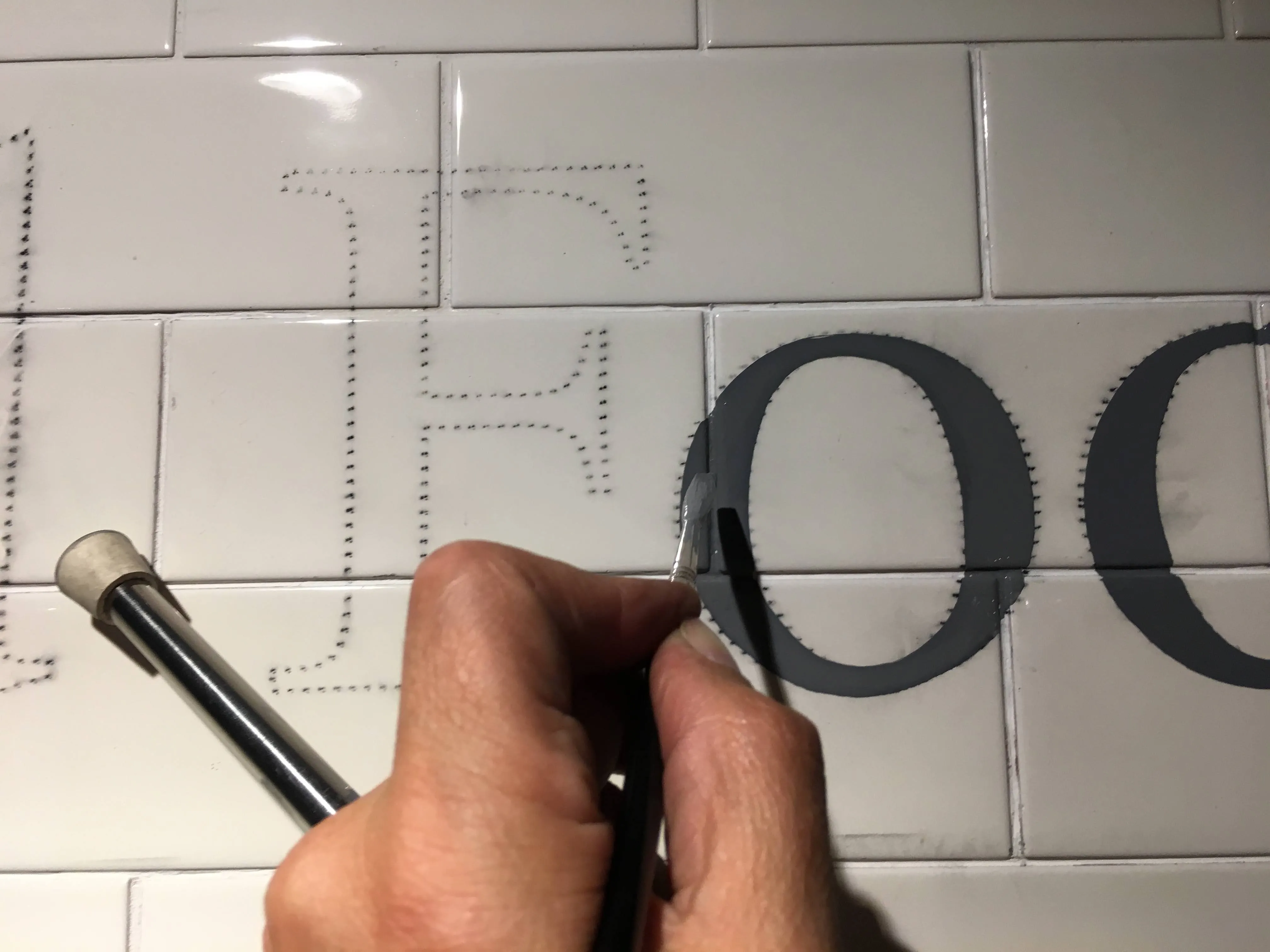
Sign Writing
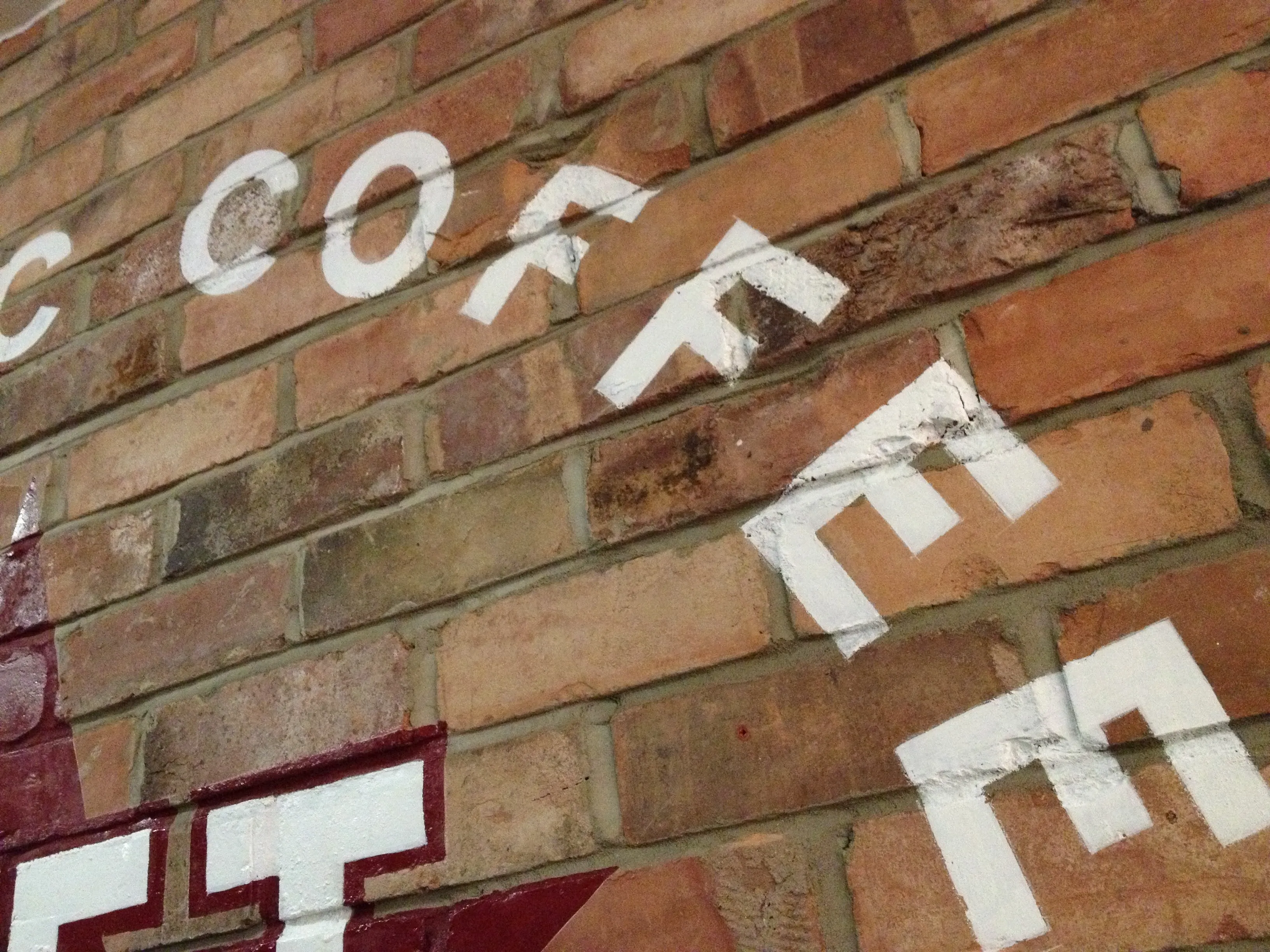
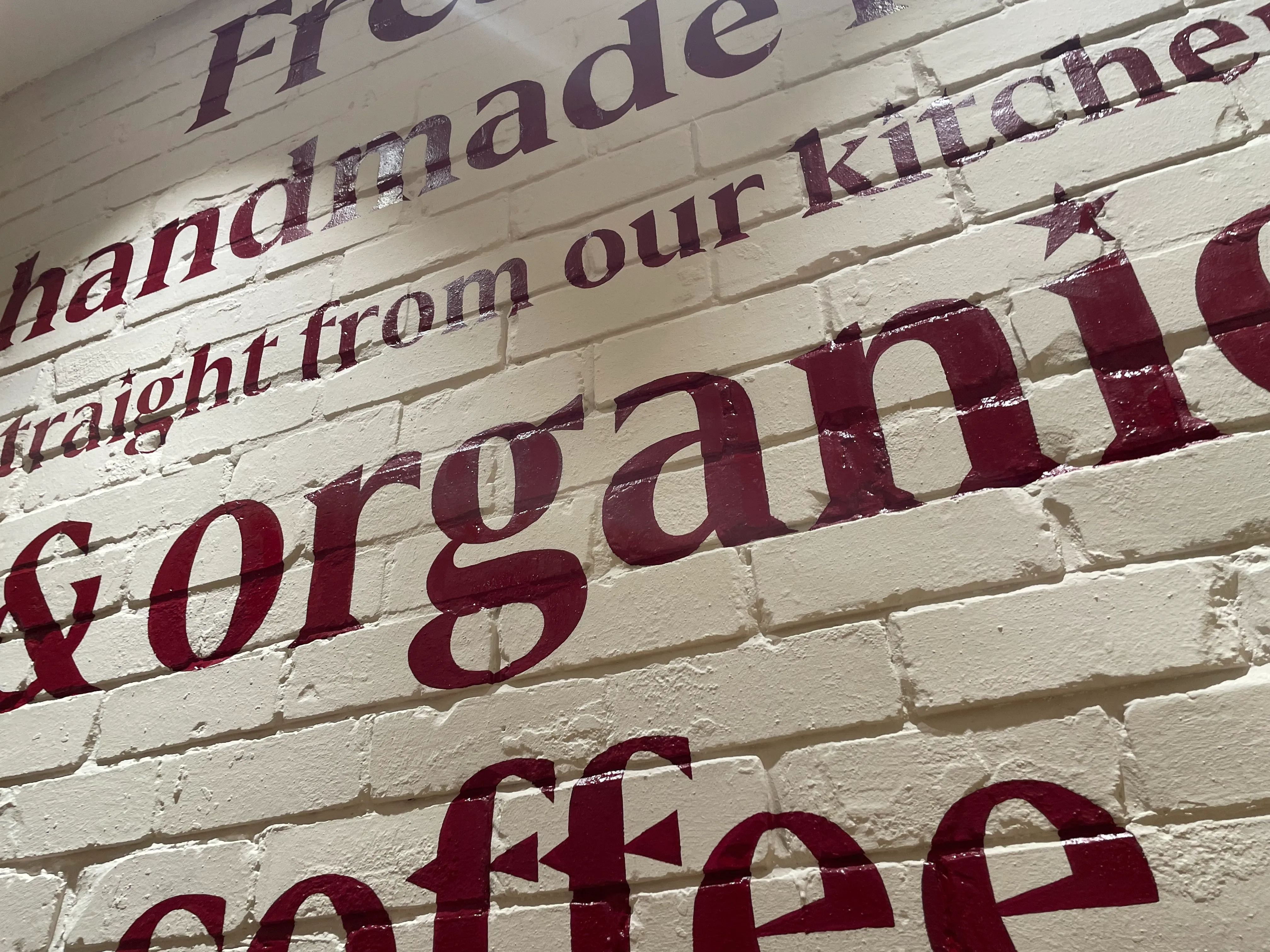
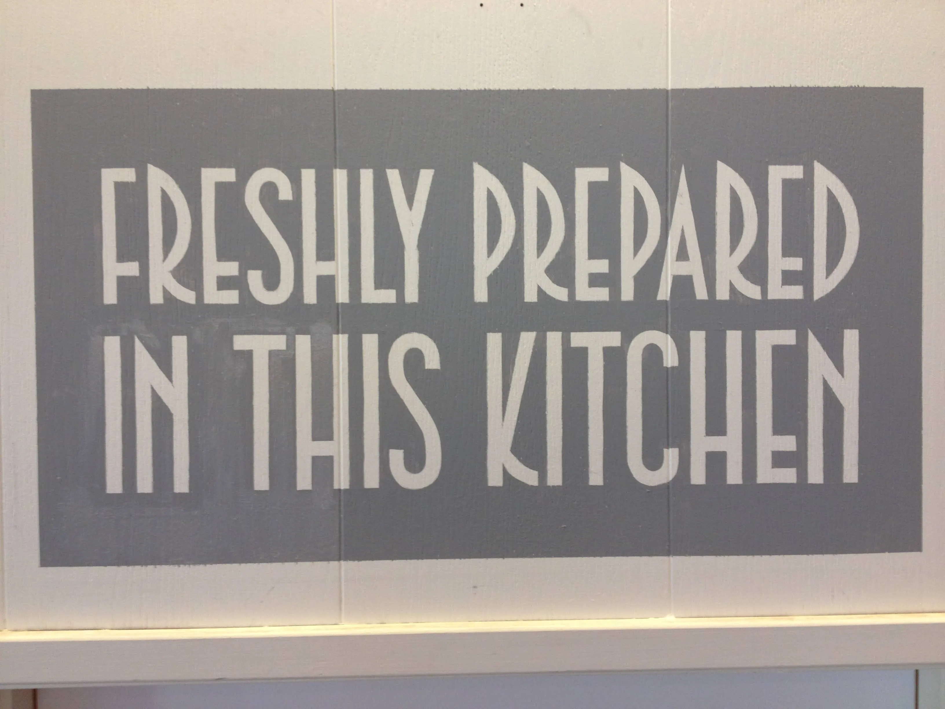
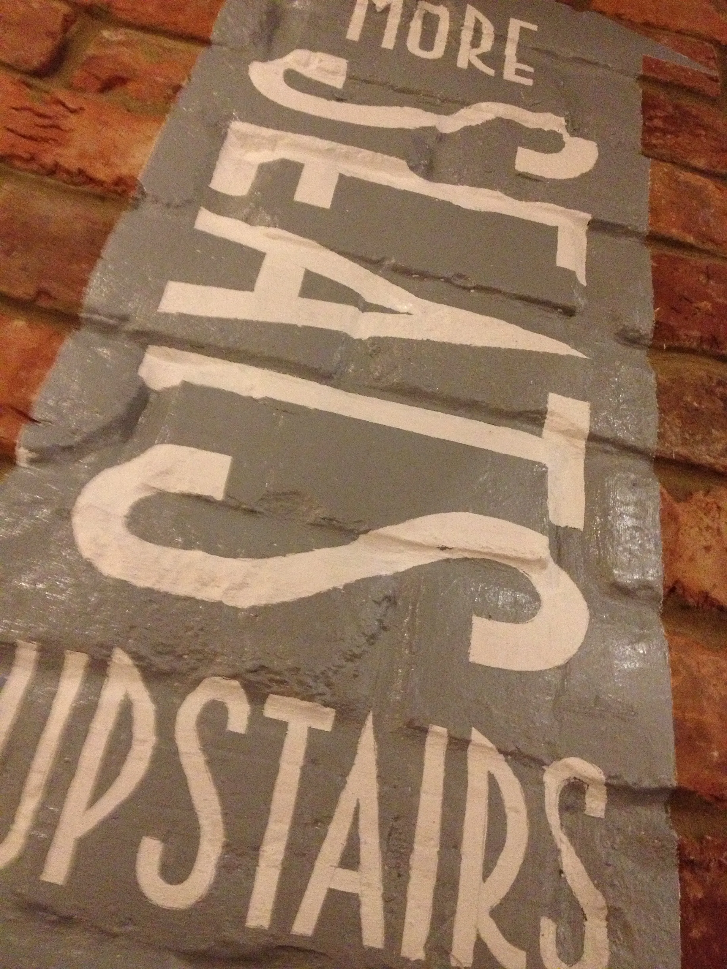
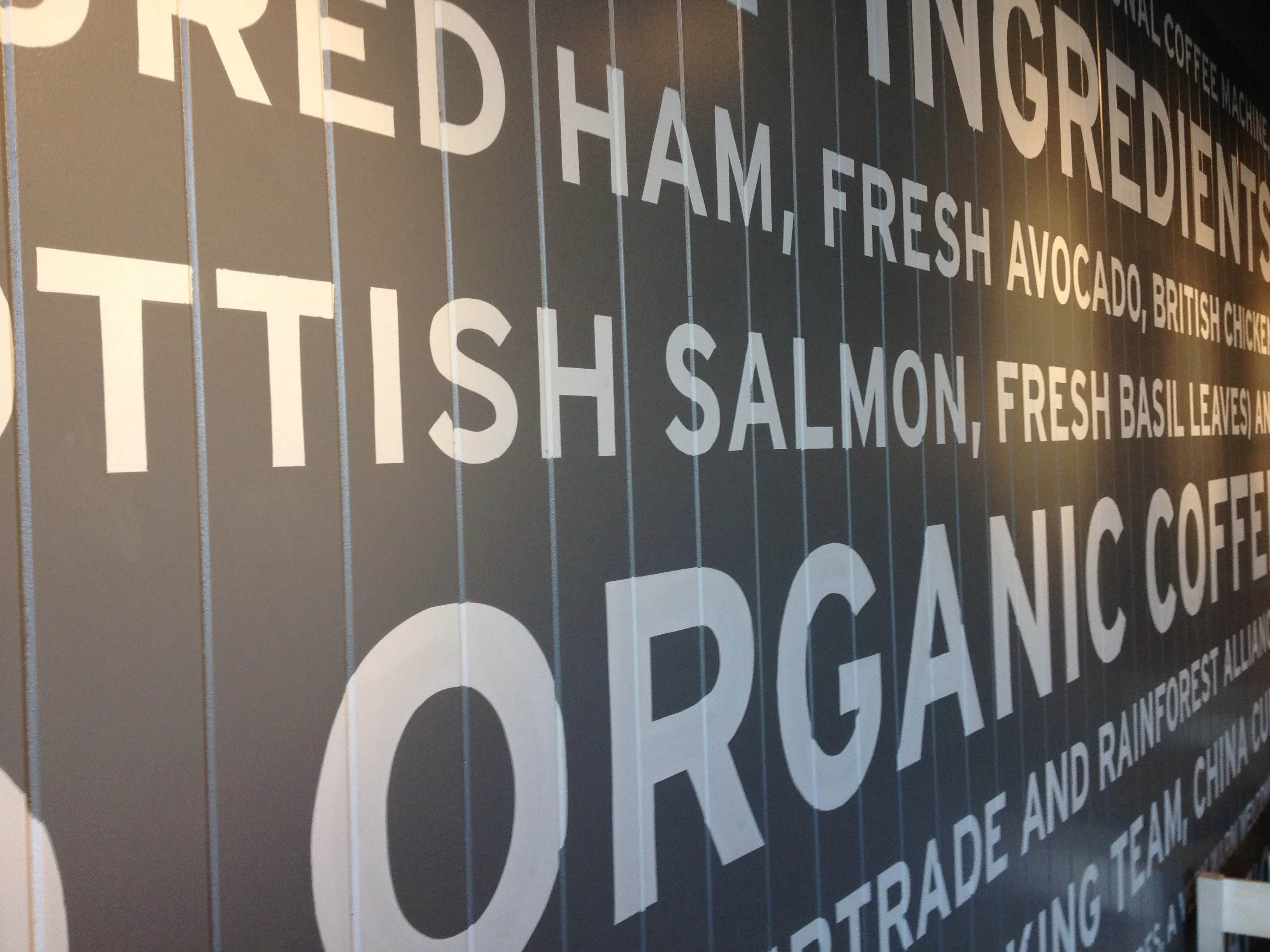
Hand Painted Typography
Working on the Pret A Manger rebrand was an incredible experience, with the design team fully embracing the charm and authenticity of hand-painted typography. To bring the creative vision to life, Brilliant Signs was commissioned to manage the nationwide rollout.
I collaborated closely with Mark at Spectrum Signs, and together with a small team of 3 signwriters, we hand-painted Pret’s refreshed brand identity across stores nationwide. This extensive project showcased the power of traditional craftsmanship in modern branding, combining attention to detail with large-scale execution.
Supported by friends and collaborators along the way, the rebrand brought consistency and authenticity to Pret’s visual identity, ensuring the brand stood out across the UK while maintaining its welcoming, handcrafted feel.
This project demonstrates my expertise in signwriting, hand-painted branding, and large-scale rollout design for high-profile retail brands.