

FOUR WALLS
Art Direction
Design
Typography
During the pandemic, spoken word artist MYNDSTATE discovered his creative voice, leading to the release of his EP Four Walls. While working at Elvis, I collaborated with the design team to develop the graphic design and visual identity for the project.
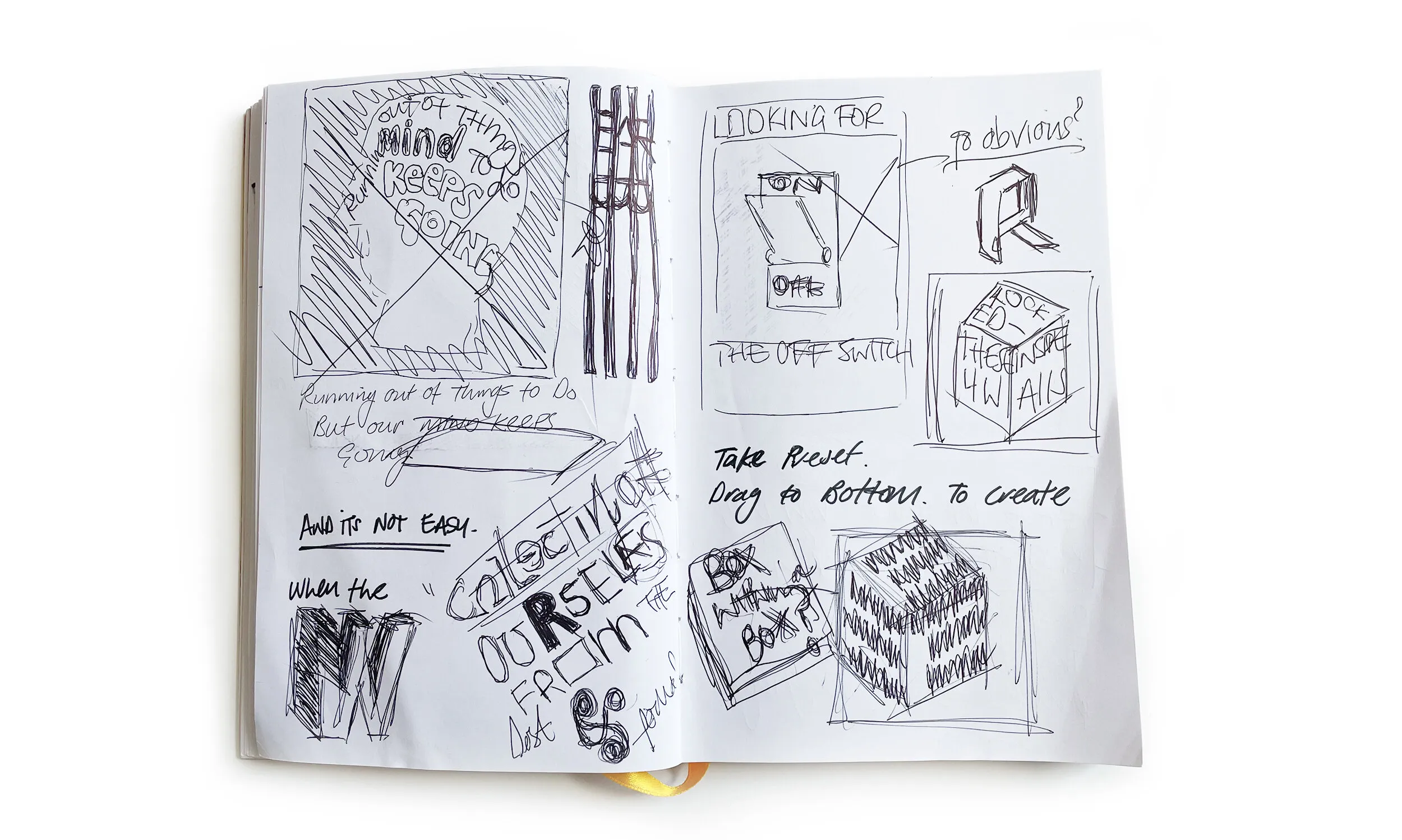
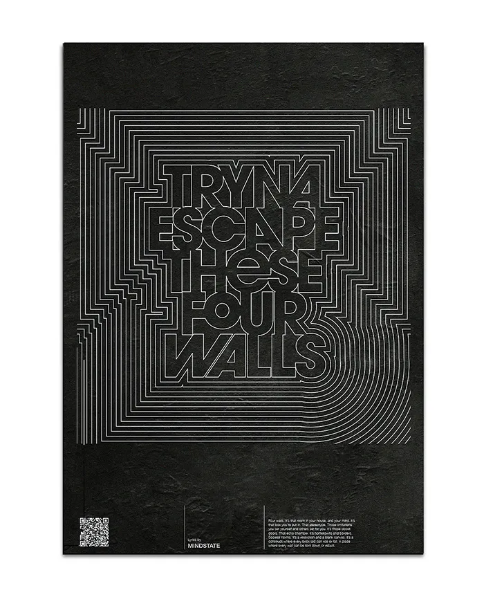
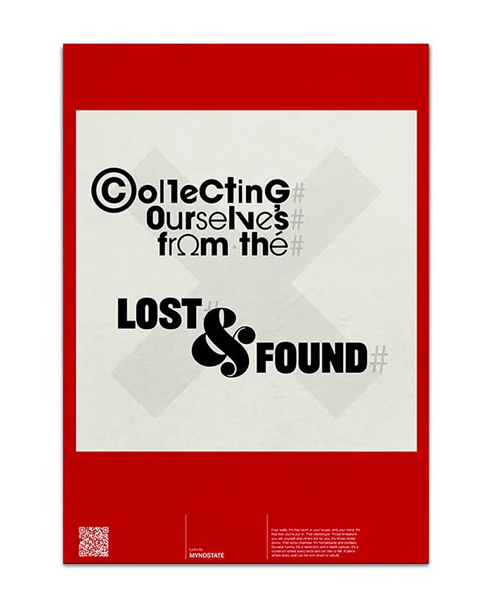
With lockdown restrictions preventing traditional photoshoots, the brief called for a typography-led design approach that could visually represent the artist and the themes of the EP without relying on photography. This constraint became an opportunity to explore bold typographic graphic design and conceptual artwork.
Working alongside designer Flo, we created a visual system inspired by minimalist design principles associated with Spin Studio. The artwork centred around the concept of confinement and personal space, reflecting the emotional atmosphere of the EP.
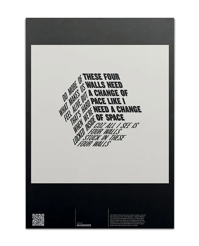
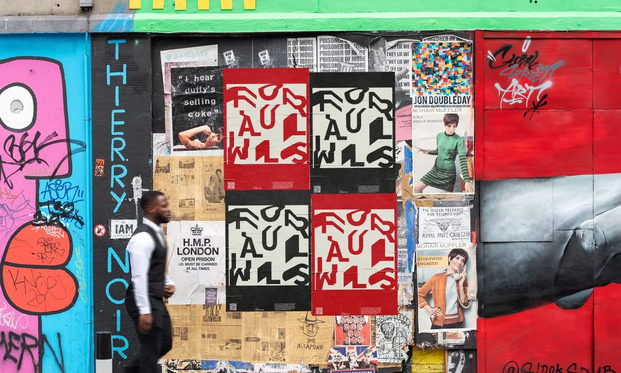
A simple square motif was introduced to represent a room or enclosed space. This device became the structural framework for the layouts, allowing MYNDSTATE’s lyrics and typography to sit within a defined visual boundary while creating dynamic compositions across the artwork.
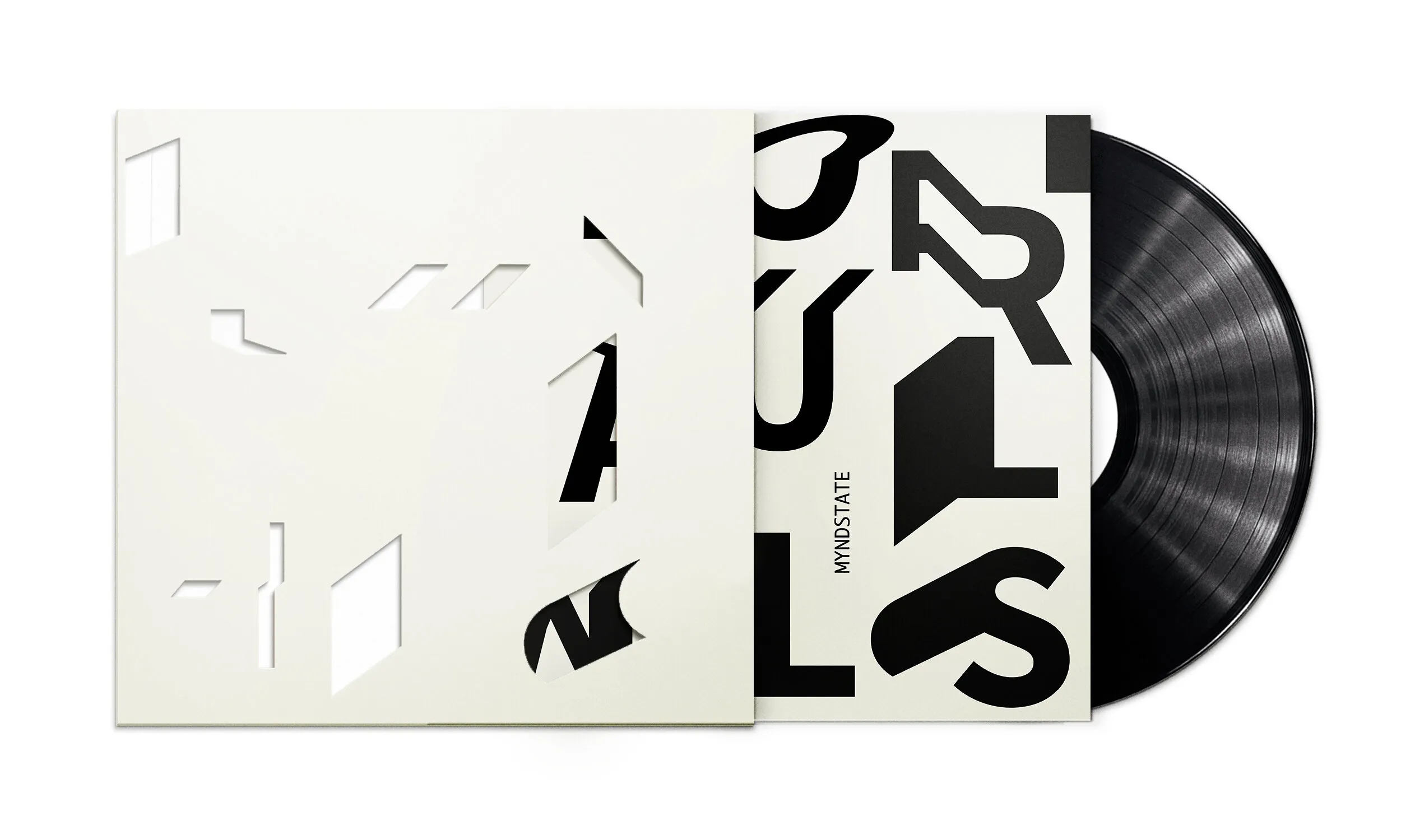
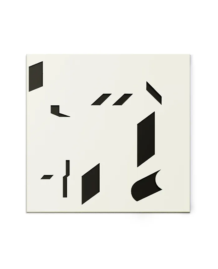
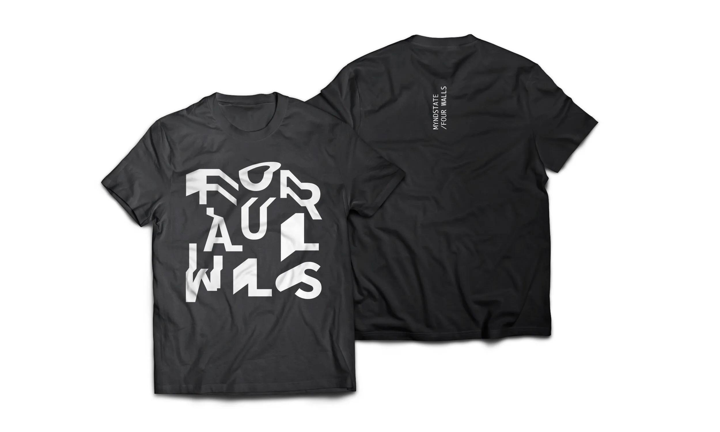
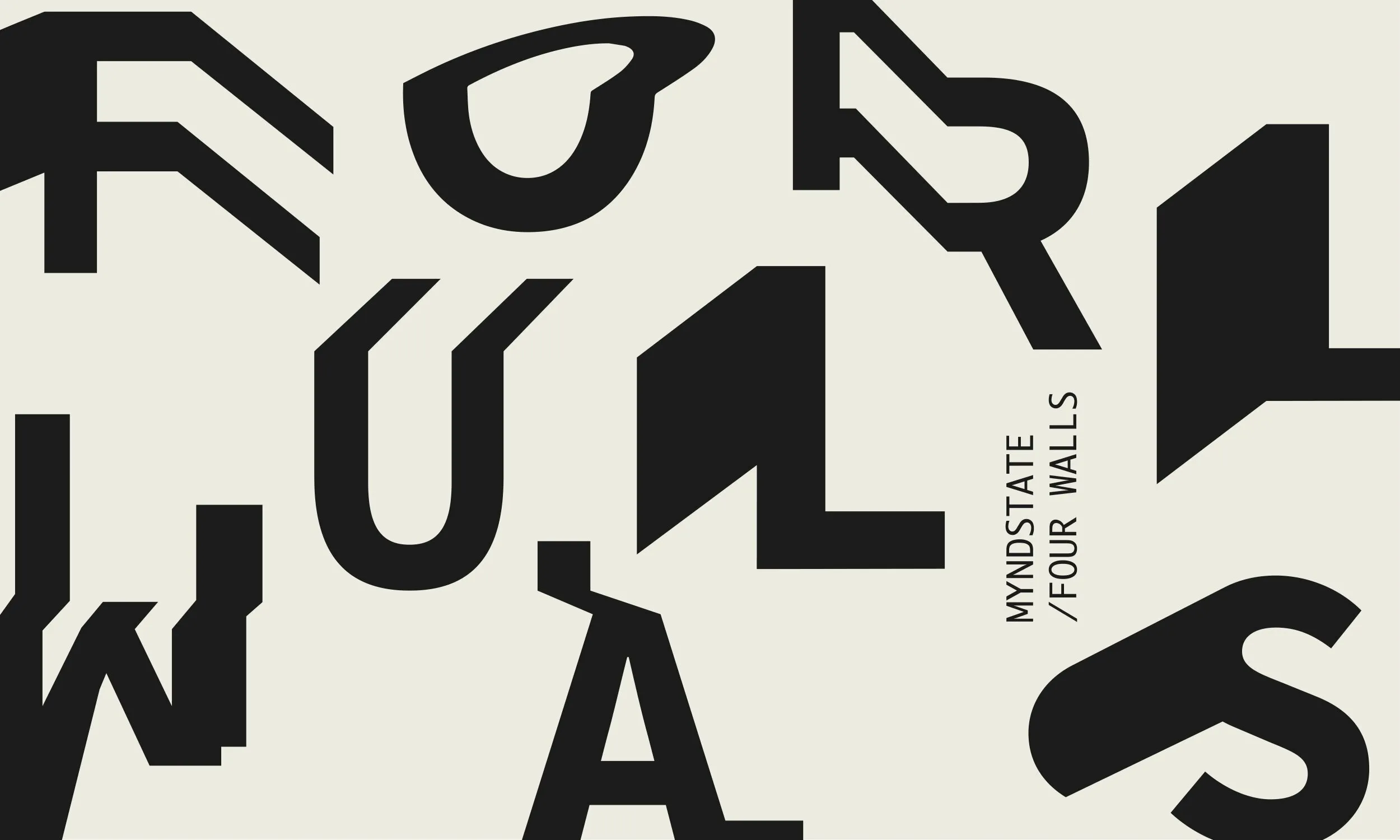
For the EP cover design, we selected a clean sans-serif typeface and manipulated the letterforms to appear as though they were bending and wrapping around invisible corners. This subtle typographic distortion added depth and movement while reinforcing the Four Walls concept of space and confinement.
The result is a modern, typography-driven piece of graphic design that balances clarity, experimentation, and strong visual storytelling. The project highlights experience in graphic design for music artwork, typographic design, art direction, and creative problem-solving, demonstrating how design constraints can lead to innovative visual outcomes.
